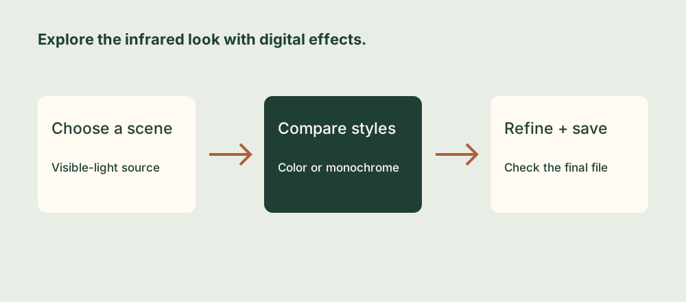
1. Choose a useful starting photograph
The infrared look often depends on the relationship between foliage, sky, water, and buildings. For a first experiment, choose a scene with leafy trees or grass and an obvious main subject. A tree against an open sky is easier to evaluate than a busy frame where every surface has a similar tone.
Open Infrared Camera and use the live camera, or tap the photo-library icon to import an existing photograph. Keep the original library image so you can return to it after trying different effects.
For a new photograph, frame the scene carefully and use the available lens controls rather than relying on heavy enlargement later. Good focus and stable capture still matter: a strong effect cannot replace missing source detail.
A standard iPhone and this app do not become a converted infrared camera. The presets interpret the visible-light image digitally. Their wavelength names identify styles to explore, rather than a physical filter being placed over the phone’s lens.
2. Compare color and monochrome presets
Swipe left or right through the presets, or use the filter selector. You can also compare presets after capturing a photograph, without taking the scene again. Begin with the default settings so you can recognize each preset’s overall direction before customizing it.
| Preset | Starting character | What to examine |
|---|---|---|
| 550nm Infrared | Vivid false-color treatment. | Whether foliage color supports the subject or overwhelms it. |
| 665nm Amplified Color | A stronger gold or yellow-toned color interpretation. | Separation between foliage, sky, and architecture. |
| 720nm Classic IR | A traditional monochrome-inspired look. | Bright foliage, dark sky, and readable midtones. |
| 850nm Pure B&W | A more graphic, high-contrast monochrome style. | Whether important highlights and shadows still contain detail. |
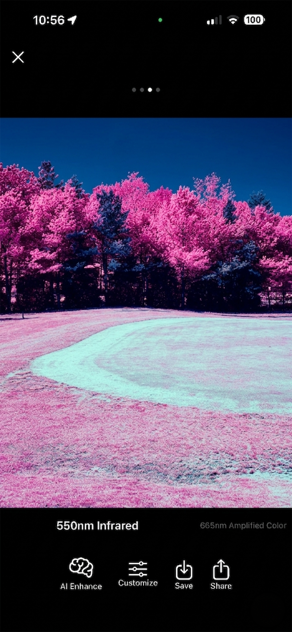
Try one scene in both a color preset and a black-and-white preset. A colorful result can be striking, but monochrome may describe the scene’s shapes more clearly. Save the stronger interpretation rather than assuming the more unusual color is always the better photograph.
3. Compare AI Enhance on and off
Tap the brain icon to toggle AI Enhance. The feature identifies likely vegetation from the source image and treats those areas differently. With color presets, compare the emphasized foliage with the more subdued surroundings. With monochrome presets, examine the additional tonal separation in leaves and grass.
Make the comparison at the same framing and preset. If you change several controls at once, it becomes difficult to tell whether AI Enhance helped. Pay attention to the edges of trees, small leaves against sky, and any green objects that are not plants.
Visible green vegetation in good light is a useful test subject. Bare branches, very dark leaves, or scenes with little green may benefit less. If detection does not suit the scene, leave the feature off and use the preset’s general treatment instead. The app remembers the AI setting when you switch presets, so check it deliberately during comparisons.
4. Refine the tones without losing the scene
Open Customize using the sliders control. In Simple mode, start with brightness, contrast, and saturation. Move one control at a time and watch both the main subject and the areas around it.
- Set brightness for the subject. Keep the building, face, or central tree readable before making the sky more dramatic.
- Increase contrast gradually. Stop before bright foliage becomes a flat white area or dark water becomes a featureless block.
- Use saturation with color presets. Strong foliage color can pull attention away from the intended subject.
- Try Advanced mode when you have a clear goal. Hue shift, channel swap, and RGB controls offer more variation; use Reset when an experiment becomes difficult to judge.
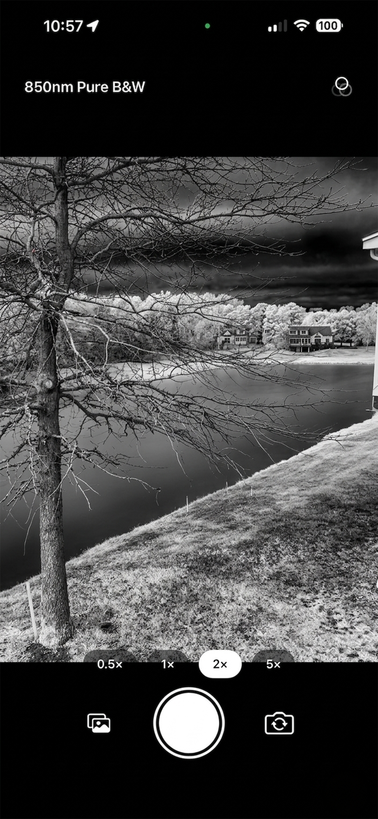
For example, compare the same tree in 550nm Infrared with AI Enhance off and on, then switch to 850nm Pure B&W. Keep its trunk and important branches readable in each version. This gives you a practical way to choose between color emphasis and a simpler tonal composition.
5. Inspect the saved photograph
Tap Save for a finished version or Share when you are ready to send it elsewhere. Open the saved photograph in Photos and check the sky, bright leaves, and fine edges at a larger size. The live view and full-resolution output can show small differences, so judge the actual file you intend to share.
| Result | Next adjustment to try |
|---|---|
| Foliage looks too harsh | Compare AI Enhance off and reduce contrast or color saturation. |
| The scene has little vegetation | Choose the preset for its overall tone; do not rely on selective enhancement to create missing foliage. |
| Important areas are featureless | Reduce extreme brightness or contrast adjustments and inspect a fresh export. |
| The next session starts with an unexpected look | Check the remembered preset, AI mode, and custom adjustments; reset the preset if needed. |
Keep a few clearly different versions rather than repeatedly saving tiny changes. A restrained color version and a monochrome version are often a useful pair. For the filter and import controls, see Infrared Camera support.